Print & Trade-show
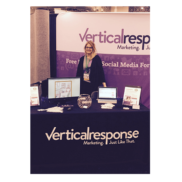
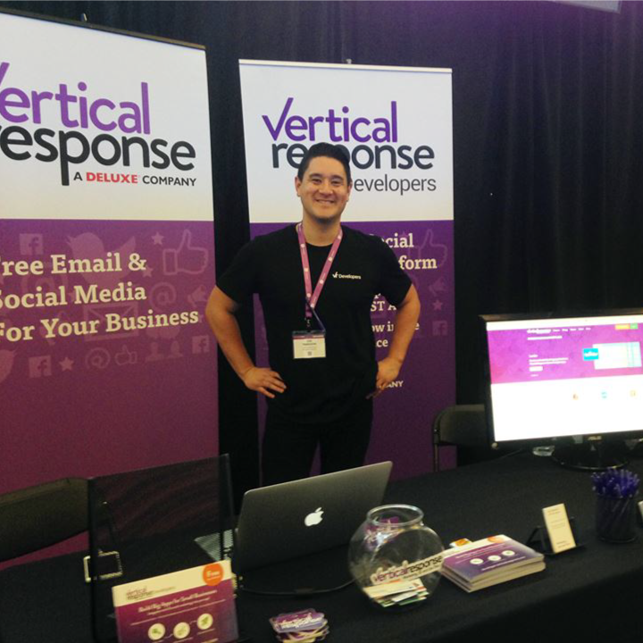
Trade-shows are busy, busy mazes of conflicting color and information overload! Oy!! My approach with trade-show design is to keep it simple, large panels with bright solid colors will do more to attract attention than the hyper complex, multi-patterned designs over-running many shows.
The Request
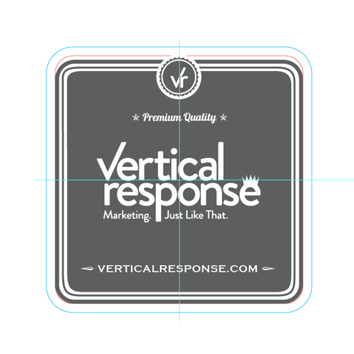
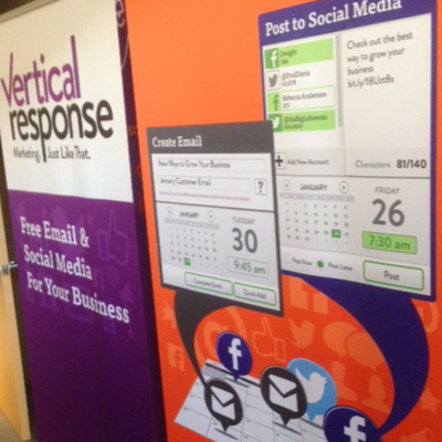
Create a new trade show look for the rebranded VerticalResponse, focus on new colors, simple graphics and new product features. Include pop up banners, sell-sheets, stickers, coasters, etc.
The Challenge
We had just come off a successful trade show look with our new brand direction with Skadeedle. Skedeedle's position was bold flat colors and a fun, flirty voice. Going back to the VerticalResponse brand, we were directed to ditch the voice, but keep the new orange and purple colors. Fortunately, purple is not a color used by anyone else in our market so this really makes us standout at shows.
The Solution
The new look was a success and drew existing customers and new sign ups alike. They really liked the new colors. The graphics are clear, while not answering every question, and encouraging people to ask questions. This look was created for the 2014 trade show season, but was ket for 2015 due to its flexibility and effectiveness.


